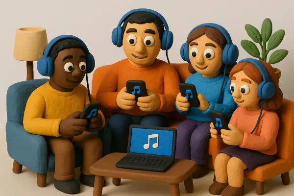
Creative Ideas for Pictures for Spotify Playlists That Stand Out


Creating eye-catching pictures for Spotify playlists is more important than you might think. A good cover can grab attention and make listeners want to click on your playlist. Whether you’re looking for inspiration or want to create something unique, there are plenty of ways to make your playlist covers stand out. Here’s a guide to help you come up with creative ideas for your Spotify playlist pictures.
Key Takeaways
- Look at popular playlists for ideas and trends.
- Use graphic design tools to create custom covers.
- Keep it simple with clean designs and bold colors.
- Consider hiring a designer for a professional touch.
- Add text to give context and attract listeners.
Get Inspired By Other Playlists
Let's face it, sometimes the best ideas come from seeing what others are doing. When it comes to creating eye-catching Spotify playlist covers, there's no shame in drawing inspiration from existing designs. It's all about putting your own spin on things, but first, let's see what's already out there.
Check Out Popular Spotify Covers
Take some time to browse through Spotify's most popular playlists. Pay attention to the covers that immediately grab your attention. What makes them stand out? Is it the color scheme, the imagery, or the typography? Consider what genres are trending and how their visuals reflect the music. You might find some cool exclusive stickers that artists are using to promote their playlists.
Explore Different Genres
Don't limit yourself to the genres you typically listen to. Venture into different musical territories and see how they visually represent themselves. A chill acoustic playlist might have a minimalist, nature-inspired cover, while a high-energy electronic playlist could feature bold, abstract designs. This exploration can spark unexpected ideas and help you think outside the box. Consider these points:
- How do different genres use color?
- What types of imagery are common in each genre?
- How do they incorporate text and typography?
Follow Your Favorite Artists
Check out the playlists created by your favorite artists. Often, they put a lot of thought into the visual presentation of their playlists, reflecting their personal style and musical taste. You can gain insights into their creative process and discover unique design elements that you can adapt for your own playlist covers. It's a great way to see how professionals approach playlist names and visual branding.
Remember, inspiration isn't about copying. It's about observing, analyzing, and then creating something entirely new and unique that reflects your own vision and the essence of your playlist.
Create Your Own Unique Covers
Okay, so you want something really you? Let's ditch the stock photos and generic designs. Creating your own playlist covers is where the magic happens. It's all about injecting your personality and style into your music. We're talking about making something that screams you.
Use Graphic Design Tools
There are tons of graphic design tools out there, and many are super easy to use. You don't need to be a pro! Think of tools like Canva or even Adobe Express. They have templates ready to go, or you can start from scratch. The key is to play around and see what feels right. Don't be afraid to experiment with different layouts, fonts, and image combinations. It's all about finding your vibe. Adobe Express is a great option for customization.
Experiment with Colors and Textures
Color is powerful. It can set the whole mood of your playlist. A chill playlist might need soft, muted tones, while a high-energy one could use bright, bold colors. Textures add another layer of interest. Think about adding a subtle grain or a cool pattern to your background. Here's a few ideas to get you started:
- Color Palettes: Use online tools to find color schemes that complement each other.
- Texture Overlays: Add subtle textures like paper, fabric, or grunge to your design.
- Contrast: Play with contrasting colors to make your text and images pop.
Incorporate Personal Photos
This is where you can get really unique. Use photos that mean something to you. Maybe it's a picture from a concert, a snapshot of your favorite place, or even just a cool selfie. Personal photos instantly make your playlist cover stand out. Just make sure the image quality is good! No one wants to see a blurry, pixelated mess. If you want to add a personal touch to your playlists, custom covers are the way to go.
Don't overthink it. The best playlist covers are often the ones that feel the most authentic. Use images and colors that resonate with you and the music you're sharing. It's all about creating a visual representation of your musical taste.
Hire a Professional Designer
Sometimes, doing it yourself just doesn't cut it. We've all been there, right? That's where bringing in a pro can really make a difference. Let's explore why and how to get the best results.
Find Talented Freelancers
Finding the right designer is like finding the perfect musician for your band – it takes a bit of searching. Start by checking out freelance platforms. These sites are goldmines for talent. Look at portfolios, read reviews, and see who vibes with your style. Don't just go for the cheapest option; think about who really gets what you're going for. A good designer will bring your vision to life, not just slap something together. Consider these platforms:
- Upwork
- Fiverr
- Dribbble
Discuss Your Vision
Communication is key. Once you've found a designer, have a detailed chat. Explain the mood of your playlist, the kind of listeners you're trying to attract, and any specific ideas you have. The more info you give them, the better they can nail the design. Don't be afraid to share examples of covers you like. This helps them understand your taste and direction. Think of it as giving them the sheet music to your song.
Get Custom Artwork
The best part about hiring a designer is getting something totally unique. No more generic stock photos! A pro can create artwork that perfectly captures the essence of your playlist. This could mean custom illustrations, creative typography, or a cool photo edit. It's all about making your playlist stand out and grab attention. Plus, having a unique cover can really boost your brand if you're an artist or curator. Think of it as your playlist's visual signature. If you want to create custom Spotify playlist cover art, this is the way to go.
Hiring a professional designer might seem like an extra expense, but it's an investment in your playlist's success. A great cover can attract more listeners, boost your brand, and make your playlist look super polished. It's like putting a frame around a masterpiece – it just makes everything better.
Utilize Stock Photos and Graphics
Sometimes, the best approach is to not reinvent the wheel. We can find amazing resources already out there! Using stock photos and graphics can be a super efficient way to create eye-catching playlist covers without needing to be a design whiz or a photography expert. Let's explore how to make the most of these readily available tools.
Browse Free Image Libraries
There are tons of websites offering free stock photos and graphics. Sites like Unsplash, Pexels, and Pixabay have huge libraries of high-quality images that we can use without spending a dime. It's important to double-check the licensing terms for each image to make sure it's okay to use it for our playlist cover, though. We don't want any copyright issues!
Select High-Quality Images
Not all stock photos are created equal. We want to choose images that are high-resolution, visually appealing, and relevant to the theme of our playlist. Avoid blurry or pixelated images, and look for photos with good lighting and composition. Think about the overall mood we're trying to create and select images that match that vibe. For example, if we're making a playlist of chill acoustic songs, a serene nature scene might be perfect. If it's a high-energy workout mix, maybe something more dynamic and vibrant.
Mix and Match Elements
Don't be afraid to get creative and combine different stock photos and graphics to create a unique cover. We can use graphic design tools to overlay text, add filters, or create collages. Think about using a background image and then adding a graphic element on top, like a cool icon or a stylized text overlay. The key is to experiment and see what looks best. Remember to keep it simple and avoid cluttering the design. A clean, well-designed cover will always be more effective than a busy, confusing one. Consider using graphic design tips to make your playlist cover stand out.
Using stock photos doesn't mean our playlist cover has to look generic. With a little creativity and effort, we can transform these readily available resources into something truly unique and eye-catching. It's all about finding the right images and combining them in a way that reflects the personality of our playlist.
Embrace Minimalism for Impact
Sometimes, less really is more. When it comes to playlist covers, a minimalist approach can be incredibly effective. It's all about making a statement without overwhelming the viewer. We've found that simplicity can cut through the noise and grab attention in a big way.
Keep It Simple and Clean
The key to minimalism is to strip away anything unnecessary. Think about reducing your design to its most basic elements. This could mean using a single shape, a simple color palette, or a single, impactful image. A clean design feels modern and sophisticated, and it's easy on the eyes. We like to think of it as visual decluttering.
Focus on Key Visuals
Instead of cramming a bunch of elements into your cover, choose one or two key visuals that really represent the essence of your playlist. This could be an abstract shape, a simple icon, or a carefully chosen photograph. Make sure your chosen visual is high-quality and easily recognizable, even at a small size. For example, if your playlist is about running, a simple silhouette of a runner could be very effective. We've seen playlists about focus that use a single circle, and it works great.
Use Bold Typography
Typography can be a powerful tool in minimalist design. Choose a font that is clean, legible, and makes a statement. Consider using a bold font for the playlist title to make it stand out. Experiment with different font sizes and weights to create visual hierarchy. Just remember to keep it simple – one or two fonts are usually enough. We often use sans-serif fonts for a modern look, but a well-chosen serif font can also work well. Think about how playlist cover art can be enhanced with the right font.
Minimalism isn't about doing the least amount of work; it's about making deliberate choices to create the biggest impact with the fewest elements. It requires a strong understanding of design principles and a clear vision for your playlist's aesthetic.
Here's a quick guide to minimalist design elements:
- Color Palette: Limit yourself to 2-3 colors.
- Imagery: Use simple shapes or high-quality photos with lots of negative space.
- Typography: Choose one or two fonts and use them consistently.
- Layout: Keep the design uncluttered and balanced.
Leverage Color Psychology
Color psychology is a big deal when it comes to playlist covers. It's not just about picking pretty colors; it's about how those colors make people feel. Think about it: a bright, sunny yellow screams energy, while a deep blue whispers calm. We can use this to our advantage to draw listeners in.
Choose Colors That Match Your Mood
Think about the vibe of your playlist. Is it a collection of upbeat pop anthems? Or is it a mellow mix for late-night studying? The colors we choose should reflect that. For example, if we're curating a chill playlist, we might lean towards cooler tones like blues, greens, and purples. These colors are often associated with relaxation and tranquility. On the other hand, a high-energy workout playlist might benefit from reds, oranges, and yellows, which evoke excitement and motivation. It's all about creating a visual representation of the music's emotional landscape. Spotify uses distinct color schemes for its playlists, so we should too.
Create Contrast for Visibility
Contrast is key to making our playlist cover pop. If we're using a dark background, bright colors will stand out. If we're using a light background, darker colors will do the trick. This is especially important because playlist covers are often viewed as small thumbnails. We want to make sure our cover is easily recognizable, even at a glance. Think about the overall aesthetic of Spotify itself. It's a pretty dark interface, so brighter covers tend to catch the eye more easily. But it's not just about being bright; it's about using colors that complement each other and create a visually appealing image.
Harmonize with Playlist Theme
It's important that the colors we choose don't just look good, but also make sense with the overall theme of the playlist. If we're creating a playlist of 80s synth-pop, we might want to use neon colors and geometric shapes to capture that retro vibe. If we're creating a playlist of classical music, we might want to use more muted and sophisticated colors to convey a sense of elegance and refinement. The goal is to create a cohesive visual identity that reinforces the playlist's musical identity. Consider adding text to establish context for the playlist.
Color is a powerful tool. By understanding how different colors affect people's emotions and perceptions, we can create playlist covers that are not only visually appealing but also emotionally resonant. It's about creating a connection with our listeners and giving them a glimpse into the musical journey that awaits them.
Add Text for Context
We often overlook the power of words, but adding text to your playlist covers can seriously boost their appeal. It's all about giving people a quick snapshot of what they're about to hear. Let's explore how we can make text work for us.
Include Playlist Title
This might seem obvious, but making sure your playlist title is clearly visible is super important. Think of it as the headline that grabs attention. A well-placed title tells people exactly what kind of vibe they're in for. We want to make it easy for listeners to find and recognize our playlists at a glance. For example, instead of a generic title, we can use catchy Spotify playlist names to attract more listeners.
Use Catchy Descriptions
Descriptions are our chance to add a little flavor and personality. Instead of just stating the obvious, we can use descriptive words that evoke a feeling or set a scene. Think about what makes our playlist special and try to capture that in a short, punchy sentence. It's like writing a mini-movie trailer for our ears!
Highlight Featured Artists
If our playlist is dedicated to a specific artist or features a collection of collaborations, let's shout it from the rooftops! Highlighting featured artists not only gives credit where it's due but also attracts fans of those artists to our playlist. It's a win-win situation. We can use bold text or a different font to make the artist's name stand out.
Adding text is a simple way to give our playlists more context and personality. It helps people understand what to expect and makes our playlists more discoverable. Let's not underestimate the power of a few well-chosen words!
If you want to learn more about our services and how we can help you, visit our website today! We have lots of useful information waiting for you. Don't miss out on the chance to discover what we offer!
Wrapping It Up
So there you have it! Making your Spotify playlist covers pop doesn’t have to be rocket science. Just remember to keep it simple, use some eye-catching colors, and maybe throw in a bit of text to give folks a clue about what they’re getting into. Your playlist is like a little world of sound, and a cool cover can really draw people in. Plus, with all the tools out there, you can whip up something awesome in no time. So go ahead, get creative, and make those playlists stand out! Happy designing!
Frequently Asked Questions
How can I find inspiration for my playlist cover?
You can look at popular Spotify playlists, check out different music genres, or follow your favorite artists to get ideas.
What tools can I use to create my own playlist cover?
You can use graphic design apps like Canva, Photoshop, or free tools like Picsart to design your own covers.
Is it expensive to hire a professional designer?
Not always! Many freelance designers offer affordable rates, and they can create a unique cover just for you.
Where can I find free images for my playlist cover?
Websites like Unsplash, Pexels, and Pixabay have a lot of high-quality, free images you can use.
What should I consider when choosing colors for my cover?
Think about the mood of your playlist! Use colors that match the vibe and create contrast to make it stand out.
How important is adding text to my playlist cover?
Very important! Adding a title or description helps people understand what your playlist is about and can attract more listeners.