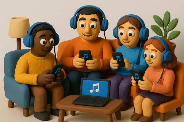
Creative Ideas for Pictures for Spotify Playlists to Stand Out


Creating eye-catching pictures for Spotify playlists can set your music apart in a crowded space. With so many playlists available, having a unique cover can grab attention and draw listeners in. Whether you're an artist or a music lover, the right visuals can reflect the vibe of your playlist and make it stand out. Here are some creative ideas to help you design standout pictures for your Spotify playlists.
Key Takeaways
- Use nature or retro themes for a unique touch.
- Bold typography can make your playlist title pop.
- Incorporate personal photos to add a special feel.
- Choose bright colors to make your cover stand out.
- Keep designs simple for better visibility.
Unique Visual Themes for Your Playlist Covers
When we set out to create our playlist covers, we like to try things a little differently. Exploring unique styles gives our music collection its own personality and often sparks a whole new vibe. We have found that experimenting with different visual ideas really sets our playlists apart.
Nature-Inspired Designs
Our love for the outdoors often guides our design choices. We tap into nature by using soft greens, earthy browns, and ocean blues. Here’s how we roll with it:
- We choose photos of forests, mountains, or even a rugged coastline.
- We mix natural textures like wood grain or leaf patterns.
- We keep the color palette relaxed and balanced.
Every design helps us feel connected to the world around us, and it’s always a fun ride.
Retro Vibes
Sometimes we feel like taking a trip back in time. Retro styles give our covers that old-school charm with vintage color schemes and a slightly worn look. We usually:
- Opt for sepia or faded tones with a touch of bright accent colors.
- Play around with grainy textures to recreate a nostalgic feel.
- Throw in quirky, old-fashioned elements that remind us of past decades.
We even enjoy exploring new tools that let us customize covers with inspired retro aesthetics, merging old with new in a playful mix.
Minimalist Aesthetics
Keeping things simple is our jam. A minimalist design makes the message clear and the cover easy to digest. We focus on stripping down to the essentials by:
- Removing distracting elements to keep the attention on one key image.
- Using a limited color palette to ensure the design stands out.
- Prioritizing clear, uncluttered space for any text or icons.
Below is a quick table that captures what we love about minimalist designs:
| Aspect | Benefit | Example |
|---|---|---|
| Simplicity | Easy on the eyes | One bold icon |
| Focus | Clear communication | A standout image |
| Balance | Creates visual harmony | Even spacing layout |
We reckon each design style adds its own flavor to our playlists, making cover creation both fun and meaningful.
Using Typography to Make a Statement
Bold Fonts for Impact
When it comes to playlist covers, choosing a bold font gives our design an extra oomph. A sharp, impactful font instantly grabs attention and makes the playlist title stand out. We like to:
- Pick fonts that remain clear at any size
- Experiment with different weights for a powerful look
- Mix fonts when necessary, but keep it simple
We often lean on bold text choices to nail that first impression.
Creative Text Layouts
We enjoy arranging text in unexpected ways to make our covers exciting. It’s not just about where the text goes, but how it interacts with the overall design. Here’s our usual game plan:
- Try various alignments to see what best fits the mood
- Shift between vertical and horizontal placements for a dynamic look
- Adjust spacing until every word feels just right
A creative layout transforms basic text into an engaging story, drawing listeners into our musical world.
Colorful Typography
Playing with color can totally change the vibe of a cover. We like to use a mix of vivid hues and subtle tones to make our text pop while keeping it readable. Our approach is pretty straightforward:
- Limit the palette to two or three complementary colors
- Ensure the text color contrasts well with the background
- Use gradients or shadows sparingly to add a bit of depth
Our designs often benefit from vibrant color tips that help us create a pleasing and refreshing look.
Incorporating Personal Touches
When it comes to making our playlists feel like they truly belong to us, adding a dash of personal style is a game changer. We've found that mixing our own creative efforts with simple, everyday images can transform a standard playlist into something that tells our story.
Your Own Artwork
Sometimes, we take matters into our own hands by creating artwork that screams us. Whether it’s a quick doodle on a napkin, a digital painting on our tablets, or even a scanned sketch from our journals, our original designs make our playlists unmistakable. Here are a few ways we get creative:
- Experiment with different drawing tools or apps
- Combine various art styles for a layered look
- Use vibrant colors to capture the mood of your tunes
We even put together a quick reference table that sums up our approach:
| Type | What It Represents | Quick Tip |
|---|---|---|
| Doodle Art | Raw, spontaneous creativity | Use bold strokes for emphasis |
| Digital Painting | Modern and slick vibe | Play with filter effects |
| Mixed Media | Unique collage feel | Combine photos with sketches |
Family Photos
Nothing says personal like including snippets of our day-to-day life. Family photos remind us of where we come from and add a cozy, intimate feel to our playlists. We enjoy mixing in casual snapshots with our custom art to keep things real. Here’s what works for us:
- Pick moments that make you smile
- Choose photos with natural lighting
- Keep the image clear and simple
Our favorite moments are often the ones captured off the cuff—those snapshots bring back memories and make our playlists feel like a personal diary.
Travel Memories
Travel photos are a fantastic way to infuse our playlists with wanderlust. Each image tells a story of a road trip, a city break, or a weekend getaway. Incorporating these photos reminds us of adventures past, motivating us to hit play and journey down memory lane. A few ideas we love include:
- Highlight key destinations with a portrait shot
- Use scenic landscapes to set a relaxing tone
- Mix in vibrant city life photos for an energetic vibe
We often compare our playlists to our year-end summary, where every snapshot of our experiences adds to the overall narrative. This blend of travel memories gives our playlists an unmistakable personal flair.
We believe that a touch of personal flair makes every playlist uniquely ours.
Color Schemes That Pop
When it comes to making our playlist cover art really catch the eye, we can’t ignore the power of a well-chosen color scheme. Here, we’ll break down some fun and practical ways to use color to make our covers pop.
Contrasting Colors
We love using contrasting colors to give our playlist covers a kick. By pairing two hues that sit opposite each other on the color wheel, we create a design that practically jumps off the screen. This method makes our covers incredibly dynamic and full of character.
Some tips we follow:
- Use strong, bold contrasts to highlight important text or images.
- Experiment with complementary color pairs to find the right balance.
- Be mindful not to overdo it, so our design doesn’t feel chaotic.
To help us visualize, here’s a quick table comparing design elements with contrasting colors versus more muted palettes:
| Element | Contrasting Colors | Muted Colors |
|---|---|---|
| Text Visibility | High, stands out | Softer, blends in |
| Mood | Energetic and vibrant | Relaxed and calm |
| Overall Impact | Bold and attention grabbing | Subtle and understated |
In our experience, adding a dash of bright colors to areas that need a pop can pull everything together.
Mood-Based Palettes
Here, we set our color choices according to the vibe of our playlist. We decide on a palette that not only fits the music but also tells a story at a glance. For a playlist that feels chilled, we might go with cooler tones and a smidge of pastel. For something more upbeat, warmer shades work wonders.
Our approach usually includes:
- Picking a main color that reflects the overall mood.
- Adding one or two secondary shades to complement and highlight details.
- Testing on different backgrounds just to be sure the mood is conveyed properly.
It’s awesome how a carefully chosen palette can instantly communicate the feeling behind a playlist – it’s like a snapshot of the vibe.
Seasonal Themes
We enjoy playing with seasonal themes to keep our covers fresh and timely. Using colors that align with a particular season can add an extra layer of relevance. For instance, crisp, cool tones work well for winter, while warm, vivid hues scream summer.
Some ideas we experiment with include:
- Spring: Light greens and soft yellows that evoke a sense of renewal.
- Summer: Bold reds, oranges, and bright colors to capture the energy of the season.
- Fall: Earthy tones like deep orange and brown for a cozy feel.
Mixing in seasonal colors can be a fun way to make our playlists feel relevant and exciting. We often brainstorm ideas around these themes and adjust our picks based on the latest vibe we’re aiming for.
Overall, by exploring and mixing these different color strategies, we find that our designs become a lot more engaging and memorable.
Creative Collages and Mosaics
We love mixing up different looks to create something fresh, and collages or mosaics are a fun way to showcase our taste. In this section, we dig into three techniques that help us tell our music stories visually.
Album Cover Mashups
Imagine taking a few album covers that match your playlist’s vibe and mashing them together into one bold design. We often start by selecting 3-5 covers that share similar themes. Our approach is to:
- Cut out key features from each cover
- Arrange the pieces in a balanced layout
- Experiment with transparency and overlapping layers
Check out our favorite cover art tool to help with the initial design scraps. A little bit of experimentation can yield amazing mashups that really pop.
Mood Boards
Mood boards let us put together a variety of visual elements—colors, textures, fonts, and even sketches—to pick a direction for our cover art. We typically gather:
- Color swatches that reflect the vibe
- Snippets of artwork or photos
- Fonts or minor design elements we want to reuse
Sometimes we arrange these in a simple table to visualize our plan:
| Element | Example | Note |
|---|---|---|
| Colors | Red, Blue, Green | Sets our mood |
| Textures | Grainy, Smooth | Adds depth |
| Icons/Images | Musical notes | Keeps it on-theme |
This process gives us a clear idea of how our final cover should feel.
Storytelling Through Images
When our cover art tells a story, it creates an instant connection with our listeners. We try to capture some narrative elements by:
- Choosing images that each represent a part of our playlist’s journey
- Aligning these images so they guide the viewer’s eye across the design
- Adding details that spark curiosity or emotions, like subtle backgrounds or unexpected icons
Our work on these designs reminds us that every picture is a mini-story that can either invite someone in or leave them guessing.
With these creative methods, we believe our playlist covers become more than just images—they turn into a visual conversation about the music we love.
Tips for Eye-Catching Designs
We’ve learned that a simple design can turn heads, especially when working on our Spotify covers. We always start by stripping away the nonessential parts because we know that every extra element can steal attention from what truly matters.
Keep It Simple
In our experience, less is definitely more. We believe that a clean layout gives us the best chance to shine. Here are a few points we follow:
- Use only the necessary images and text.
- Stick to one or two colors to keep the design focused.
- Avoid extra effects that complicate the look.
We even put together a quick table to see why simplicity works so well:
| Design Principle | What It Does |
|---|---|
| Minimal Elements | Keeps the focus on the music |
| Limited Colors | Helps the key parts stand out |
| Clean Layout | Prevents distraction from details |
Also, while planning our layouts, we often refer back to some creative ideas that help us decide on color schemes and overall composition.
Focus on Readability
We always make sure our text is easy to read even in small sizes. Here’s what we check:
- Choose fonts that are simple and clear.
- Make sure the text size stands out against the background.
- Test the cover on different devices to be sure everything is clear.
This way, when someone glances at our playlist, they immediately know what it’s about and feel drawn in.
Avoid Clutter
There’s nothing worse than a cover filled with too many details. We keep clutter at bay by following these steps:
- Keep the layout open with plenty of breathing room (negative space).
- Avoid layering too many elements on top of each other.
- Use each element purposefully so nothing feels out of place.
We always remind ourselves that making the design neat and focused helps communicate our vibe more effectively than a mess of visuals.
That’s our take on creating covers that not only catch the eye but also clearly convey our music style. Enjoy playing around with your own designs!
Inspiration from Other Playlists
Explore Popular Covers
We often scroll through popular covers to see what catches our eye. It gives us a chance to pick up fresh ideas that we might not have considered on our own. Our favorite covers always stand out by using distinct color pops and unique typography. Sometimes, a design even includes cute icons that add a playful twist to the whole look. We take a moment to note these details and let them inspire our own creative efforts.
Follow Your Favorite Artists
We like to keep an eye on how our favorite artists craft their playlist visuals. There’s a lot we can learn by simply observing what works for them:
- They consistently use design elements that reflect their unique style.
- They blend images and text in ways that feel both fresh and familiar.
- They experiment with colors and layouts, making each cover feel personal.
This approach reminds us that even simple ideas can make a big impact if we pay attention to the details.
Check Out Curated Lists
Curated lists are a treasure trove when it comes to design inspiration. We dig into these collections to see a mix of styles and trends all in one place. Here are a few reasons why we find them super helpful:
- They bring together a variety of styles, making it easy to compare and learn.
- They highlight trends so we know what’s buzzing in the design community.
- They encourage us to think outside the box by showcasing unexpected combinations.
From our experience, diving into curated lists can spark new ideas and keep our creative energy flowing.
Every time we explore these sources, we come away with a couple of new tricks in our design toolkit. Happy designing!
Looking for fresh ideas? Check out how other playlists can spark your creativity! Dive into a world of music that inspires and motivates. Don't forget to visit our website for more amazing playlists and tips!
Wrapping It Up
So there you have it! Crafting a standout cover for your Spotify playlist isn’t rocket science. It’s all about being creative and having fun with it. Remember, your cover art is the first thing people see, so make it pop! Whether you go for a cool photo, some funky text, or a simple design, just keep it true to the vibe of your playlist. And hey, don’t stress too much about it. Just experiment and see what works. You never know, your next cover could be the one that gets everyone clicking. Now go ahead, unleash your inner artist, and make those playlists shine!
Frequently Asked Questions
What are some unique themes for playlist covers?
You can use nature, retro styles, or minimalist designs to make your playlist covers stand out.
How can typography enhance my playlist cover?
Using bold fonts and creative text layouts can grab attention and make your playlist title pop.
Can I use my own artwork for playlist covers?
Yes! Personal artwork, family photos, or travel memories can add a unique touch to your playlist.
What color schemes work best for playlist covers?
Try using contrasting colors or mood-based palettes to make your cover art eye-catching.
What are some tips for creating effective playlist designs?
Keep your design simple, focus on readability, and avoid clutter to make your cover appealing.
Where can I find inspiration for my playlist covers?
Look at popular covers, follow your favorite artists, or check curated lists for ideas.